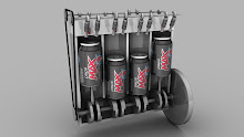
I was quite happy with my first design for the portfolio cover, although I do agree that the image was not obvious enough as to what it is. I decided to use an image which was originally going to be used for a new website for my design. Due to time constraints I quickly dismissed that idea but still had some of the images left, so after a few small edits came up with this as my portfolio front cover:


No comments:
Post a Comment